PROJECT: 3 DAYS | UX DESIGNER / PROTOTYPER
Strava App Feature Design
This is an unsolicited re-design of the Strava App, and is no way associated with the company.

App Feature Design
Taken on as a self-imposed design challenge, this is an exercise in rapidly prototyping possible new features for Strava’s sport and fitness tracking service. The project was completed in 3 days and is a combination of user research, understanding and rapid prototype development; resulting in 2 new features for the Strava Mobile App.
Services
App Re-Design
Prototyping
User Research
User Testing
Design Thinking
Design Challenge
2021
The Ask
The challenge was to choose an app or service I use regularly and attempt a rapid redesign. I chose Strava as I’m an avid cyclist and user of the platform. Though I had immediate ideas about what to re-design, I sought out other users of the platform to see what their perspectives might be. What do they use Strava for mostly? What do they like about it? What are their frustrations with it?
The Solution
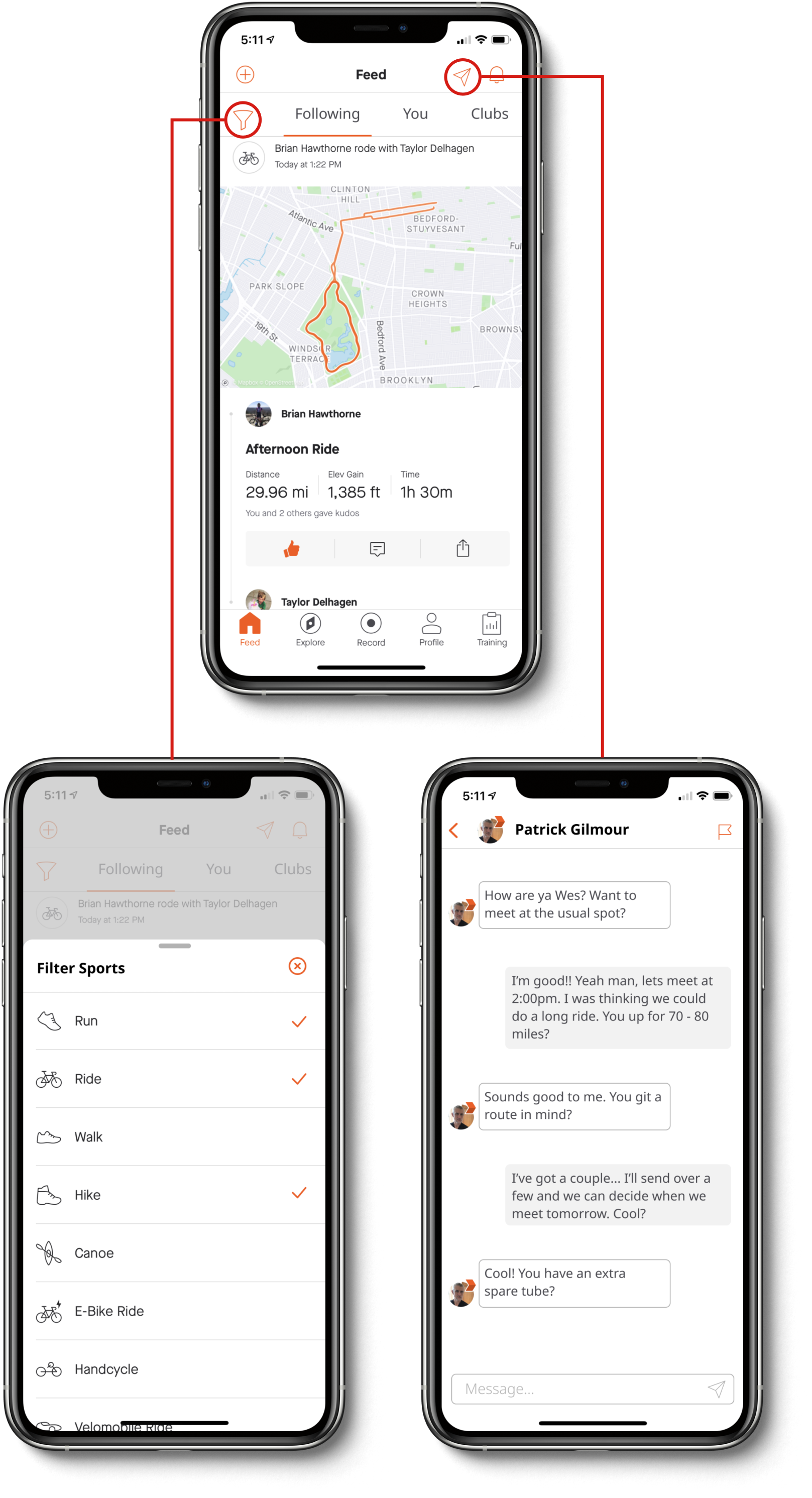
Though there were many features or actions users wish existed on the platform, this app redesign focuses on some of the Social Network aspects of the service. Direct Messaging and Filtering of activities on the Home Feed were added to the Mobile App.
Both of these features addressed the Social Network aspect of Strava that Users say they use the app for. With such a focus on connecting with other athletes, users said there is not a good way to communicate with other users of the app directly. Likewise, with so many different types of activities being recorded, users expressed a wish to “filter” what type of activity they see in their feed.
Process
I placed the constraints of 3 days in order to ensure a rapid process, but also allowing for time to engage users on the platform to hear about their experiences with Strava. The process was roughly broken into three categories of User Research, Design Thinking and Feature Design.
User Research / Day 1
• Found Strava Users through App
• Conducted User Survey & Interviews
• Uncovered New Perspectives

Understanding / Day 2
• Revealed Themes and Patterns
• Prioritized and Clustered Concepts
• Broad Exploration of possible Solution
Feature Design / Day 3
• Visual Research
• Sketching
• Rapid Prototyping
• High-Fidelity Prototype

User Research
The research was conducted by creating a survey and sharing it as a post to the Strava site. The survey focused on how athletes use Strava, what they liked and disliked about the desktop version versus the mobile app, and what they would like to see added to the service or app. I followed up with a few users to conduct one-on-one interviews to get even more detail about athlete’s frustrations and desires.

Brainstorm for Survey questions.

Post on Strava to find participants.

Post on Strava to find participants.
What was learned
Most of the Strava users that replied where avid users of the app. They almost all use the service primarily in the Mobile App versus the Desktop version. Though there were many similar suggestions for feature additions one big similarity was that everyone uses the Social Network aspect of the app, to view other athletes rides as well as to give and receive “kudos” for the activities they post.
Posts have a comments section, but this is the only way to communicate with other users on the app. Some users also expressed frustrations with not being able to filter what types of activities show up in the “feed”. There were many frustrations and pain points that these users experienced that could be great opportunities to design for, and also some areas of the service that users really like that could be expanded upon.
Understanding
After analyzing the data from the survey and interviews I created Affinity Clusters in order to group and then prioritize possible changes to the app based on user feedback.
Sticky notes highlighting the affinity-cluster results.
Narrowing Focus
I homed in on the ideas of Filters and Messaging; being able to directly connect with other users on the platform as well as the ability to control what you see in your feed. This decision was based on an Importance-Difficulty Matrix considering the grouped option, as well as the fact that the Social Network aspect of the service was a primary use for every user surveyed.
This led me to the next question…

Importance-Difficulty Matrix
How Might We?
How might we design features for the Strava Mobile App that address users interests in using the Social Networking aspect of the app and how they see their Feed while seamlessly integrating them into the current UI and structure of the app?
Feature Design
The approach to the design of these two new features, Filters and Messaging, was to make them integrate seamlessly into the existing user interface, flow and structure of the app. In order to do this I began by rapidly sketching ideas, conducted visual research of other apps, which eventually led to high-fidelity screens that I could prototype.
Sketching
Based on some visual research in other Direct Messaging apps and many quick sketches I was able to come up with a set of basic sketches to move forward with.

New Home Feed

Direct Message Athletes

Message Page

Filter Sports in the Feed
Wireflows
In order to make the process of the upcoming prototype easier I created a flow of the most important screens. A change that does occur in the UI is that now the athletes that a Strava user Follows and is Following can be accessed in a user’s Profile screen, as well as seen in the Messages screen. It was important to show how a user would navigate from the Profile section to Messaging, and to understand the steps in that flow.
flow diagram of the screens featuring new features in the Strava Mobile App.
High Fidelity
I went straight from sketching to High Fidelity as the UI is pretty well established and these features are meant to easily integrate to the existing layout and style. Here are a few new screen examples highlighting the new features in full fidelity. The “mail” icon and the “filter” icon are additions to the existing UI of the Feed page that activate the newly designed features.
Prototype
The prototype is a live clickable version of the app highlighting the two additional features of Direct Messaging, Filtering the Feed, and how they might seamlessly integrate into the existing structure. Give it a try!

Reflections
There are plenty of other opportunities to design for the needs of athletes using Strava, many of which speak directly to Strava’s competitors that deal with Fitness Data Analysis and Route creation. It is also recognized that Strava may not want to get fully into the Social Media landscape with Messaging, but there is potential for more Users attention on the app if athletes could connect more directly with other users of the app. Considering the competitive landscape of Fitness Tracking, this might be worth a deeper exploration.
*This is an unsolicited re-design of the Strava App, and is no way associated with the company.